key pages
lilt website redesign
Revamping Lilt’s online presence with a cohesive and engaging design across multiple core pages.
Client
Lilt
Year
2021 - 2024
PROJECT OVERVIEW
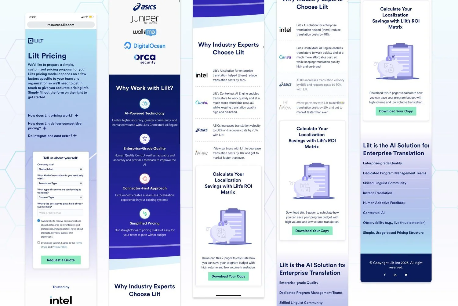
During my time at Lilt, I contributed to the redesign of three key pages on their website: the pricing page, the Why Lilt page, and the Lilt vs Competitors page. Each page served a specific purpose in educating potential clients about Lilt’s value proposition, simplifying the user journey, and making the platform more accessible. My role involved creating a user-friendly design that aligned with Lilt’s updated branding while clearly communicating the benefits of using Lilt over competitors.
the design process
-
I collaborated with the product and marketing teams to understand the core needs of Lilt’s target audience. For the Why Lilt page, the focus was on demonstrating the value and benefits of the platform. The Pricing page required clear, straightforward communication of Lilt’s pricing tiers, while the Lilt vs Competitors page needed to provide a detailed, side-by-side comparison of Lilt’s offerings versus its main competitors.
-
To ensure a cohesive user experience, I worked with the branding team to align the design across all three pages, ensuring consistency in color schemes, typography, and visual elements. Each page maintained its individual focus while adhering to the overarching brand guidelines, ensuring a seamless experience for users as they navigated the site.
-
For the Pricing and Why Lilt pages, I simplified the information to allow users to easily compare plans and understand Lilt’s core benefits. On the Lilt vs Competitors page, I structured the content so that users could easily navigate between Lilt’s offerings and those of its competitors, using interactive features like battle cards and comparison charts.
-
The Why Lilt page included interactive elements such as battle cards, hover effects, and dynamic tabs to highlight Lilt’s advantages. Clicking on a battle card would take users to the Lilt vs Competitors page, where they could dive deeper into a direct comparison. On the Lilt vs Competitors page, I incorporated comparison charts and quotes from Lilt’s existing partners to visually and emotionally reinforce the platform’s strengths.
-
The design of all three pages aimed to maximize user engagement and conversions. The Pricing page was streamlined for easy decision-making, the Why Lilt page clearly outlined the reasons why enterprises should choose Lilt, and the Lilt vs Competitors page provided an easy-to-understand, data-driven comparison to help potential clients make an informed choice.
THE RESULT/impact
The redesigned pages successfully conveyed Lilt’s value proposition and made it easier for potential clients to understand why Lilt was the right choice for their multilingual content needs. By providing clear, actionable information and creating engaging, interactive experiences, these pages contributed to higher user engagement and increased conversions. The comparison features on the Lilt vs Competitors page especially helped users quickly grasp Lilt’s advantages over competitors, fostering trust and confidence.